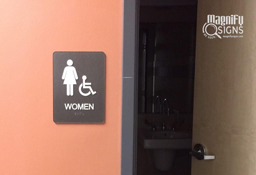
The Americans with Disabilities Act, also known as ADA, was established in 1992 and reviewed in 2010 to ensure that people with disabilities have equal access to all public accommodations. This includes public buildings, stores, restaurants, hotels, etc. Implementing the ADA accessibility guidelines includes providing signage adequate and accessible to people with disabilities. Signage is provided not only for customers but also for employees.
Such signage includes signs to eye level for people on a wheelchair, signs with large lettering, and tactile elements for seniors and people with impaired sight. Tactile signs consist of braille and raised words that can be read through touch. Additionally, you should use raised symbols or pictograms, always accompanied by raised lettering.
What businesses need ADA compliant signage
Under the ADA framework, all buildings constructed or altered after 1992 must comply with the ADA Accessibility Guidelines.
In effect, all commercial buildings in the USA need signage to inform and direct customers, according to the ADA guidelines. The obligation applies to all kinds of stores, office buildings, cinemas and theaters, restaurants and bars, hotels, sports facilities, swimming pools, health and beauty facilities, banks, schools and universities, etc.
 Which spaces in a building need ADA signs
According to the guidelines, all permanent spaces in a building need to have signs that help the visitor understand what the space is. Permanent spaces are defined as all spaces in the building that retain their purpose for more than 7 days.
Such spaces include:
- Staircases, elevators, and floors
- Conference rooms and offices
- Changing rooms and bathrooms/restrooms
- Medical examination rooms
- Spaces where only employees have access, like storage rooms, electrical and mechanical rooms, IT rooms, etc.
- Break rooms
- Kitchens
- Accessible parking spaces
Furthermore, ADA signs need to be installed wherever there are safety reasons. There should be signs for:
- Main exits
- Safety/emergency/fire exits
- Stairways and elevators
Designing ADA signage
 ADA signage is supposed to be simple, visible, and easily readable.
In particular:
- ADA signs should be in contrasting colors and have a non-glare finish.
- Braille Grade 2 is the mandatory specification for braille signs. Braille dot size is also regulated.
- Signs should include raised ISA pictograms.
- Text should be all CAPS, in a simple sans serif font without embellishments such as italics, condensation, etc.
- Font size, spaces between letters, words, elements of the sign are also regulated.
Installing ADA signage
ADA signage needs to be approachable from people with disabilities. They should not be too high for people in a wheelchair to read, or for a blind person to touch. They should be available at all times, on a surface that a person with a disability can easily approach.
To make the implementation of the above easier, the guidelines state signage installation rules. ADA signs must be installed:
- On the latch side of the door, but never on the door itself, as the person cannot easily locate the sign when the door is open. The sign should be mounted on the wall next to the door.
- The tactile characters (not the sign itself) should not be lower than 48 inches from the floor, a height suitable for people in a wheelchair. It should also be no higher than 60 inches from the floor, a height at eye level for most people.
- If there is no sufficient space on the wall next to the room, you should create a stand as close as possible to the door.
 Can ADA signage be beautiful and branded?
The strict ADA guidelines require simple, clear, no-fuss signage. While this can certainly lead to bland signs, it does not have to be so!
Yes, you need to keep characters simple and readable, use contrasting colors, and busy backgrounds are out of the question. But ADA signage can still be attractive! Here are a few ideas to consider:
- You can add your logo or brand as the top section of all ADA signs.
- You can use your brand color palette for the signs, or modify it to achieve the necessary contrast.
- You can make your ADA signs look luxurious and elegant by using materials like metal, laminate wood, casted bronze, gold hues, etc.
- Your signs could have rounded corners or an interesting frame that does not come in the way of reading the sign.
To ensure your ADA signs are compliant and make the most out of them from a branding point of view, get the help of an expert signage company. Our specialists can help you with the regulations as much as with design ideas, to create ADA signage that is both functional and attractive.


