Creating ADA-compliant signs for your office lobby can seem formidable, but it doesn’t have to be. By following some simple tips, you can be certain that your lobby signs meet the ADA’s standards for accessibility and legibility. In this blog post, we’ll review three tips to help you create ADA-compliant signs for your office lobby. From choosing the right type of font and lettering size to ensuring proper lighting and contrast levels, these tips will help ensure your lobby signs are ADA-compliant.
Use Contrasting Colors
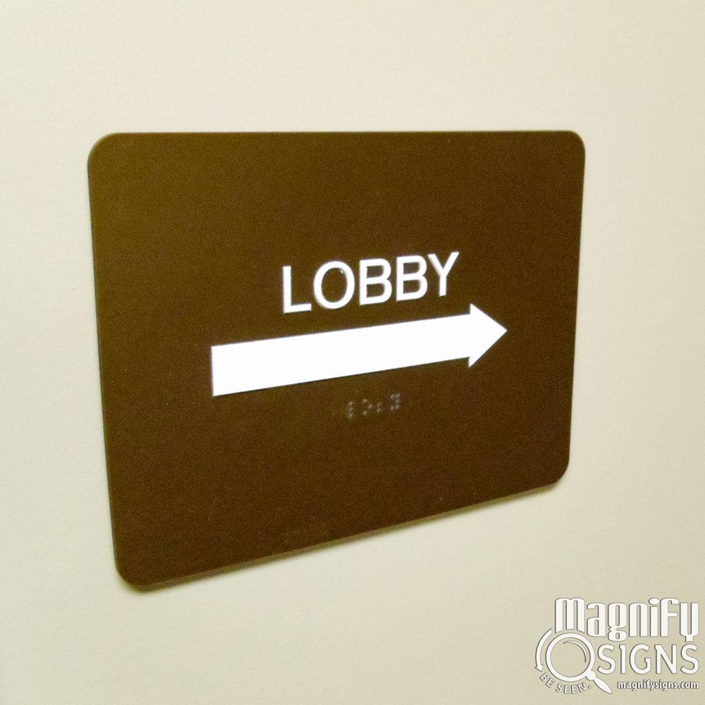
When designing ADA signs for your office lobby, it is essential to use contrasting colors. Using contrasting colors will ensure the sign is easily visible to those with low vision or color blindness. The most commonly used colors for ADA-compliant signs are black lettering on a white background or white lettering on a dark background. However, any color combination that provides good contrast can be used. Additionally, use bold lettering and ensure the font size is big enough to be easily read from a distance. It is also recommended to use colors that match the color scheme of the building or lobby, as this will create a cohesive look.

Keep it Simple
Regarding ADA signs, it is important to remember the importance of simplicity. Signs should be easy to read, understand, and follow. They should be clear and simple. This means using a clear font, simple graphics, and avoiding unnecessary decorations or patterns. The text should be large and in a plain sans-serif, easily legible font. Additionally, it is recommended to use at least a 24-point type for wall signs and an 18-point type for other signs.
It is also important to limit the number of words on the sign. Keep the message concise, as lengthy messages may be difficult to read and comprehend. Bullet points can help break up information and make it easier to process. All abbreviations or acronyms should be spelled out to ensure the message is clear and not misinterpreted. All phrases or sentences should begin with a capital letter and end with a period. Remember that signs should not only be ADA-compliant but also easy to interpret. Keeping the design simple will make sure that everyone can understand the message on the sign.
Use Braille
One important factor to consider when creating ADA signs for your office lobby or building facility is the use of Braille. Braille helps make the sign accessible to visually impaired people and allows them to read the sign with ease. It is important to remember that any text included in the sign should also be displayed in Braille form.
Including Braille in your office lobby or building facility signs will ensure that they are ADA-compliant and can easily be read by visually impaired people. In addition, by taking the time to make sure your signs meet ADA regulations, you can help ensure that all of your guests can easily find their way around your building. Contact us at Magnify Signs today to learn more about incorporating ADA signs into your office building!


