Signs throughout a hotel are often overlooked. However, they are an incredibly important part of your building! From room numbers to directional signs, custom hotel signage is a must so that your guests can partake in an enjoyable experience at your hotel.
What are the signages used in hotels?
- The Establishment: This is the most obvious necessity. Whether it’s a sign for a hotel, lodge, cottage, or bed and breakfast, you will need something to let people know the name of your establishment so it can be easily located.
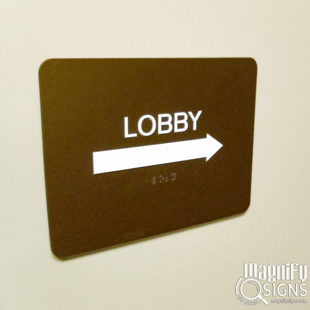
- Hotel Room Signs: The room numbers are also a given, but just as important if you want your guests to know where they are going! This also includes directional hotel room number signs so people know which direction they need to head within the halls of your building.
- No Smoking: No smoking signs for certain hotel rooms are also important to designate smoking and no-smoking areas.
- Other Doors: Housekeeping door signs, storage room signs, ice locations, and other indicators are important so staff and guests know which rooms are which.
- Check-In and Welcome: It’s always good when guests know where they can check in to their rooms! Check-in and welcome signs are a must in your lobby.
- Food: If you have breakfast or snack bars, it is important to have an indicator of where these are located, as well as which foods are which.
- Name Badges: Your staff is more personable if your guests know their names. Getting name badges for your staff members is a great way of doing this.
- Safety: Safety signage includes various critical items like exit signage that may be required to be installed within your building.
What kinds of designs should you think about?
- Colors: The colors of your signs should not only match your establishment’s branding and interior design, but also take into consideration the psychology behind colors. For example, blue and green often offer a sense of comfort and reliability to guests, whereas red and orange are energizing and eye-catching.
- Shape: You can always get more creative than the basic squares and circles by adding in some more unique shapes for a modern design. Circles and even more unique shapes like hexagons could be used to your advantage! Just be sure to plan it out to make sure it goes well with the rest of your branding and decor.
- Reflection: It’s best to avoid reflective signs because they can be hard to read. However, sometimes reflective surfaces can work in your favor.
- Contrast: The signage will be easiest to read if the colors of the letters versus the background contrast so that the letters stand out.
- Location: Where you put the signs is important for the sign itself as well as the interior design. Consider where each indicator will go before creating the signage.


