Enter a train station, a mall, an office building, or a large hotel, and you will wonder the same thing: “Where do I go now?” Thankfully, wayfinding signage is there for you and other visitors, to get you where you want to go. This article explores the many kinds of wayfinding signage, its difference from directional signage, and the ways it can help your business—and your customers.
What is a wayfinding sign?
Wayfinding refers to all the things that provide orientation to a visitor of any place, from the city center to the multi-floor retail store.
While directional signs come to mind first, wayfinding also includes things like placing the reception near the entrance of a hotel, operating an information kiosk at the airport arrivals, or placing a waiting area where it is visible from the corridor of a hospital.
As wayfinding is the sum of architectural, circulation, signage, and other features, we often refer to “wayfinding programs” instead of just “wayfinding signage.”
Having said that, wayfinding signs are one of the main components of any wayfinding program. They can make a real difference when people need to navigate large spaces, whether public or commercial.
Is wayfinding signage the same thing as directional signage?
 Wayfinding signage includes very diverse types of signs that inform and guide, from large “monuments” adorned with shop signs in a mall, to smaller labels that name hotel and conference rooms or offices.
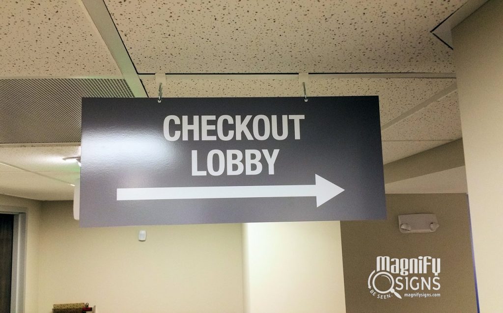
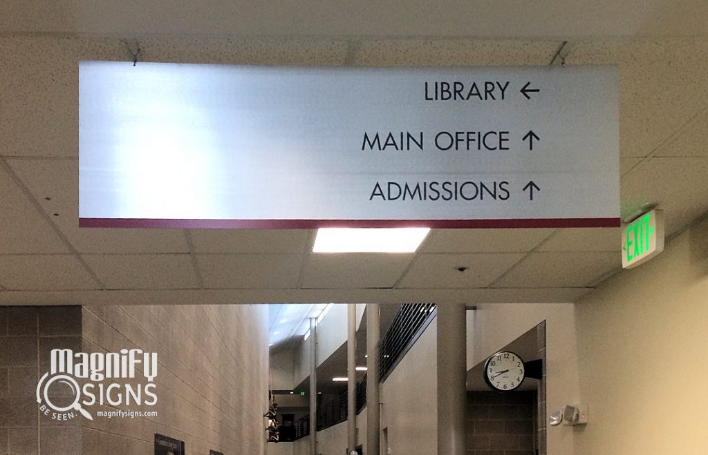
Directional signs are wayfinding signs that point toward a direction, usually using an arrow. Therefore, directional signs are a subgroup of wayfinding signage.
Both wayfinding signage and directional signs aim at helping visitors find their route in a large space. However, wayfinding signage does not necessarily bear directional arrows. For example, it could simply name a place to let you know that you have reached your destination.
External wayfinding signage
Wayfinding signage can be both external and internal.
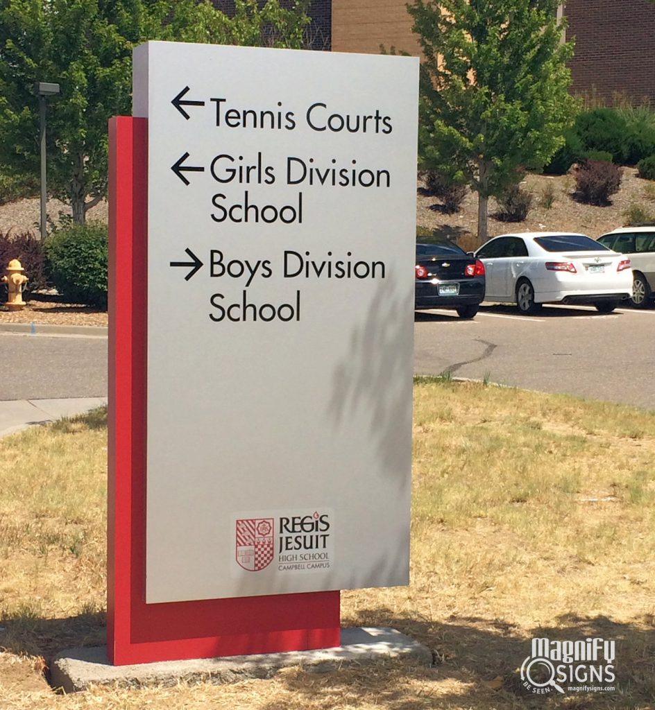
External wayfinding signage can be found, for example, at decision points like crossroads. On a university campus, external wayfinding signage at a central crossroad would indicate which way to take toward different faculties.
Wayfinding signs may also be placed outside of buildings, to indicate what the building is. For example, in a multi-building hospital, wayfinding signage would indicate which clinic is housed in each building.
They may also be simple directional signs. For example, at a parking lot, a directional sign may offer visitors directions to reach their destination within a building.
More complex wayfinding signs can be found outside of large department stores or malls, to indicate the shops one can find inside.
And map-like wayfinding signs can be placed at the entrance of a small city to give directions towards the main points of interest.
Internal wayfinding signage
 Just like external wayfinding signage, internal wayfinding signs can be used in a number of ways.
You may find them at the entrance or the lobby of a company, to indicate the departments found on each floor of the building.
You may also find them inside shopping malls, to help visitors locate specific brands. These resemble external map-like wayfinding signs and are often found in several spots around malls—especially in decision points where corridors cross, to help visitors take the right corridor. “You are here” maps often complement directional signs.
Internal wayfinding signs are also found hanging from the ceiling, to indicate restrooms, exits, fitting rooms, aisles, etc.
They are also common in elevators, staircases, and escalators, to help visitors find their floor or get to the correct underground parking level.
On doors, wayfinding signs often inform visitors of the number of a hotel room, the name of a conference room, the name of the doctor in a clinic, the rank and name of a manager in an office building, etc.
Sometimes, wayfinding internal signs are placed on the floor. This is common practice in parking spaces, as they help visitors navigate a parking space. They may also remind people of the floor at the escalator landing, or help airplane passengers find their departure gate.
They are also common when exiting a building, providing visitors with important information related to leaving the space. For example, wayfinding signs may offer directions to the parking lot, direct people to taxi and bus stations, or even indicate the street they are about to enter (ex. “Lincoln Avenue Exit”).
What are the types of signage?
As the above examples show, wayfinding applications and types are endless.
Whether internal or external, wayfinding signage and directional signs may not be what the visitor will remember best from a place. Even so, they play an important role in keeping the experience pleasant: nobody enjoys getting lost while carrying luggage or shopping bags, tugging little children with them, or having an important meeting to rush to!
People coming into a store, a public building, a mall, an airport, or even a town, expect to find wayfinding signs. Both internal and external wayfinding signage play an important part in helping them navigate the place and reach their destination effectively.
Using wayfinding signage to promote your brand
Wayfinding signage is all about efficiency and functionality. However, it’s still signage. As such, it contributes to your brand image.
Wayfinding does not have to be bland or an eyesore. On the contrary, it provides a great opportunity to reinforce your branding, by making the signage aesthetically appealing and consistent with your brand.
The best wayfinding signage strikes the right balance between functionality and branding.
How can you create functional wayfinding signage?
Functionality is key in wayfinding signage. Here are our five top tips for ensuring it:
Wayfinding signage should be minimal
The information on wayfinding signage needs to be precise and concise.
Use established pictographs along with words to facilitate comprehension of written messages.
A plain word like “Exit,” “Platform A1”, or “Restroom” with the respective symbol is effective and expected. Don’t make your signs more complicated than they need to be.
Wayfinding signage should be readable
Choose easy-to-read typography on a contrasting background.
Size the signs appropriately for different viewing distances. Leave adequate space between words and lines to make longer texts easier to read from a distance.
Wayfinding signage should be standardized
Standardize names for all buildings, rooms, etc. Display them in a consistent graphic identity. This makes them easier to spot and to understand.
Wayfinding signage should be ADA-compliant
Select typography and color combinations that comply with the accessibility guidelines of the Americans with Disabilities Act (ADA).
Providing tactile signage (raised letters, Grade 2 Braille) is part of the ADA guidelines. In this case, you should consider carefully the height and placement of your signs to make them approachable.
Combine wayfinding signs of different sizes
Different sizes of signage are usually necessary to reach all audiences.
A car driver in a parking lot, a pedestrian in the mall, and a car passenger on the road read signs from different heights and distances.
To comply with ADA, you will need tactile signage placed at a level where visually impaired people can reach it.
Top five tips to enhance branding with your wayfinding signage
 If you follow the above tips, you will ensure the functionality of your wayfinding and directional signage. But what about branding? Consider the following tips to promote your brand through environmental design.
Show the company name and/or logo on the signs
Any size of wayfinding signage has space for your company name and/or logo. Use the company name as a header/footer of the sign. You can also find creative uses for the logo, such as using it as a background.
Use your brand color palette
Use your brand’s colors in typography, background, or in the support of the signs to enhance your brand.
If needed, create a brand color palette with the logo colors and complementary ones that you will use consistently through all of your signage.
Materials matter
The materials you choose for your wayfinding signage say something about your brand. A “You Are Here” map integrated into a stone column says vintage and classic, whereas a digital “You Are Here” map on a glass and stainless steel support says hi-tech and millennial.
The information is the same, but the materials reflect a totally different branding.
Create an experience around the signage
Some kinds of wayfinding signage can offer an opportunity to create a positive experience for your visitors.
For example, you can create a meeting point around a large signage monument in a department store.
You can also use a digital, interactive “You Are Here” map to make it more attractive.
If you name buildings and rooms according to a theme (like famous personalities, local monuments, geographical features, etc) you could have “did you know” information displayed as part of your signage. Such activities create a pleasant visitor experience, triggered by the wayfinding signage.
Don’t let branding take over function
Although you can get excited about combining wayfinding signage with branding, make sure you find the right balance.
Function must come first with wayfinding signage.
Don’t let the information get lost in busy backgrounds and complex typography. Make your signage aesthetically appealing but keep the message clear and visible.


