How to Choose Your Restaurant Sign
Today, many eateries rely widely on online review sites, digital marketing, and even online orders and home delivery. Even so, they remain brick-and-mortar businesses that mainly depend on regular and new patrons walking in the restaurant and sitting down to enjoy a meal the traditional way.
This is hardly surprising: nothing compares to having a well-cooked meal in a nice atmosphere, with people waiting on you with a smile, be it for a quick snack, lunch, or diner. And this is true whether you own a sandwich corner shop or an elegant gourmet restaurant.
Exactly because a restaurant remains a convivial, social place where people like to hang out in a digital age, signage is crucial in attracting patrons and also in turning them into regulars. From store-front to indoor signs, here is what any restaurant owner needs to consider when it comes to restaurant signage.
Restaurant Store-Front Signage
Make It Big
Probably the most important sign for a restaurant is its name on the store-front. Most marketers in the food industry will tell you that there is one important rule: make it big. Once you have the perfect name that can stick to people’s minds, you need a large, visible sign for it. The size of the external sign particularly matters if you want your restaurant to be visible from a distance and from different points of view.
To attract attention easily, the usual guidelines apply: choose typography that reads well, use large-size fonts, contrast the colors of the background and the typography, avoid clutter, and choose colors that say “delicious food inside” (usually warm colors).
Consider using a monument sign or a pole sign if your facade is not right on the road or if your restaurant needs to be seen by passing cars from a distance.
Restaurant Signs Point the Way
Sometimes the name of the restaurant is enough indication of what a patron can expect to eat: Chez Pierre is probably French cuisine, Peking Palace is likely Chinese, and Zorbas’ Moussaka is Greek. When the name is not explicit enough, though, include a simple image to your sign—like a sandwich for Jackie’s Corner, or a crab for Blue.
Typography and materials can also hint at the kind of food you serve. For example, simple, modern typography on a sleek aluminum background hints at a modern cuisine, while cursive on carved wood indicates a more traditional approach. Likewise, silver cursive on a black background conveys elegant cuisine, while ranch-like typography and a bull’s head on wooden boards scream steak.
Let There Be Light!

Restaurants usually operate the evening/night shift, therefore their sign should be well lighted when the sun is down. However, in many cases, light is important during the day, too. This is especially true during winter when patrons sit inside, the doors stay closed, and passersby may wonder if the restaurant is open or closed.
Light your façade at all times to enhance your visibility and to state, “We are open” loud and clear. LED applications are ideal to light your signage at a low cost, without turning your electricity bill into something that keeps you up at night.
I Was Passing By…
People walking on a busy sidewalk are, in fact, valuable potential customers. They may not look up to see your front sign, so consider eye-level signage, including:
- Feather flags: a highly customizable solution, feather flags can be used on the sidewalk to attract attention. They are not expensive, so you can change them often. Attract attention to combos and deals or promote a seasonal offer.
- A-frame boards: besides your restaurant name, include here a blackboard. Use it for a daily message that will intrigue passersby (humor goes a long way), to indicate the daily specials, or to simply welcome patrons.
- Vinyl banners: these are an excellent low-cost solution if you have a large space available for signage, like a bare wall. Customize them to showcase deals, specials, a unique selling point like “baking pie since 1956,” or a piece of history that your restaurant was part of.
- Menu stands: exhibit your menu, or part of it, outside of your restaurant, so that people can have a sneak peek at your plates and prices. Use attractive photos that will make stomachs growl in anticipation.
Restaurant Window Signage

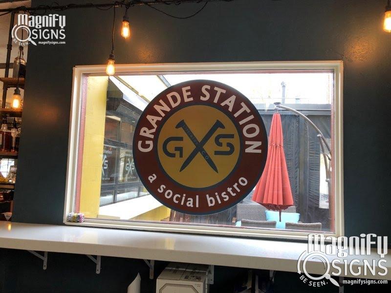
Large glass fronts make ideal support for some smart marketing. As patrons inside the shop often prefer privacy, you may want to make part of your shop window opaque. Forget curtains and wainscots: today, vinyl and decals make it easy to both create privacy inside and send a message outside at a low cost.
Contemporary decals are easy to install on the inside or the outside, are durable to weather conditions, and can be changed for a modest cost. You can customize them to your exact dimensions, colors, and messages. If you want to use the entire surface of your shop window, perforated decals are an excellent one-way visibility solution that lets the light in while allowing people in the restaurant to see outside.
The front window is particularly suited to showing much-needed information, like your phone number or service hours. It is also a great space for a seasonal greeting or decoration, letting you add a festive spirit to your shop front. Static cling decals can even be stored and used again at your convenience.
Restaurant Interior Signage
Signage does not stop at the outside of the restaurant. Not only for legal reasons, as may be the case with ADA signage, but also because signage makes your restaurant more functional, enhances its ambiance, and contributes to the patrons’ experience.
Legally-Mandated Signage
Bylaws specify the number of signs you need to display for health and safety reasons. Maximum occupancy signs, restroom signs, emergency exits, staff-only areas, and ADA rules need to be implemented in restaurants as in any other business.
The food and beverage sector also has additional regulations, like notifications on alcohol and smoking restrictions or under-age patrons.
These are all permanent signs that should be made of durable, hard-use materials like aluminum, acrylic, or plastic.
Restaurant Menus

Many restaurants go for a wall-mounted menu, especially those that are self-service or in the snack sector. The major issue with wall-mounted menus is that you need to be able to easily change menu items and prices.
What used to be a blackboard gradually became foam signs that are inexpensive to replace.
Nowadays, digital boards are also popular. They are an excellent solution for restaurants for a multitude of reasons:
- You can mix and match text and pictures to help the customer decide what they want to eat.
- You can adjust all information on your own from your keyboard. No one needs to climb up a ladder.
- You can display combos and encourage upsell even before the waiting staff asks if you would like fries with that.
- You can also display videos and keep the customers occupied while in the waiting line, making the waiting time feel shorter.
Décor and Ambiance
Vinyl murals, framed posters, motivational quotes, old photos, recipes, the daily menu… Make your signage part of the ambiance and decoration of your restaurant!
Materials vary from the least expensive to the more luxurious, and printing techniques allow you to create 100% customized, creative decorative signs. Just consult with our team on how we can turn your ideas into reality.
Your Signage Reflects Your Kitchen
One thing to never forget is that your signage, both outdoor and indoor, reflects your kitchen in the mind of your patrons.
Outdated, dirty, and poorly maintained signs immediately translate into outdated food and less than clean kitchens. Fresh, clean, sleek signage translates into a clean, professional kitchen.
It is, therefore, crucial to regularly maintain your signage. Keep maintenance in mind when you choose materials and make sure your budget covers regular cleaning, changing bulbs, and fixing letters.
Ready to upgrade your restaurant signage? Call now 303-647-9005 or contact Magnify Signs online for your free quote!


